Lorenz Curve – Measuring Income InequalityHL
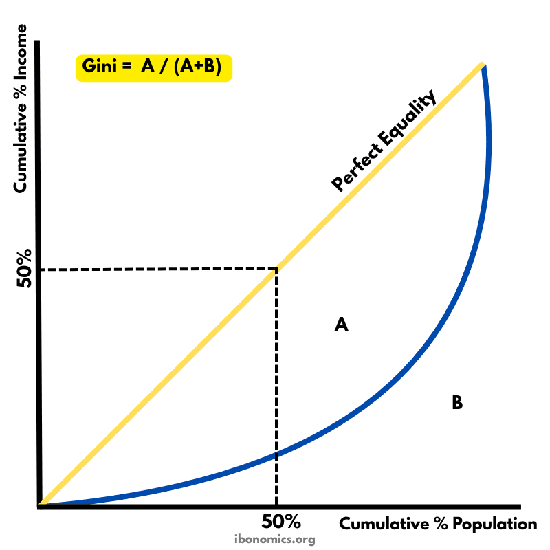
MacroeconomicsThis diagram shows the Lorenz Curve used to measure income inequality in an economy. It compares the actual distribution of income with a perfectly equal distribution.
Curves and elements
- perfect equality
- The 45-degree yellow line represents perfect income equality.
- lorenz curve
- The blue Lorenz Curve represents the actual distribution of income.
- area a
- Area A is between the Lorenz Curve and the line of equality, used in calculating the Gini coefficient.
- area b
- Area B lies below the Lorenz Curve, also used in the Gini coefficient formula.
- gini formula
- Gini = A / (A + B), measuring income inequality from 0 (equality) to 1 (inequality).
Key explanations
- 1
The 45-degree yellow line represents perfect income equality, where each percentage of the population earns an equal share of total income.
- 2
The blue curved line is the Lorenz Curve, showing the actual cumulative distribution of income across the population.
- 3
Area A is the space between the line of perfect equality and the Lorenz Curve, while area B lies under the Lorenz Curve.
- 4
The Gini coefficient is calculated as A / (A + B) and ranges from 0 (perfect equality) to 1 (maximum inequality).
- 5
A more bowed-out Lorenz Curve indicates greater inequality, while a curve closer to the line of equality indicates a more equal income distribution.
Example exam question
Using a Lorenz Curve diagram, explain how the Gini coefficient can be used to measure income inequality.
Show example answer
The Lorenz Curve compares the cumulative percentage of income received to the cumulative percentage of the population. The more the curve bows away from the 45-degree line of perfect equality, the greater the inequality. The Gini coefficient, calculated as A / (A + B), quantifies this inequality. A higher Gini indicates greater income disparity.