IBonomics Logo

IBonomics

Comprehensive study materials and practice quizzes for IB Economics students aiming for 6–7 scores. Created by tutors, for students.

Contact Us

Follow IBonomics

All social links

Quick Links

  • Search
  • Exam Overview
  • Practice Quizzes
  • Unit-Based Quizzes
  • Sign Up
  • Become a Tutor
  • Contact
  • Announcements

Study Resources

  • Microeconomics
  • Macroeconomics
  • Real-World Examples
  • International Economics
  • IA Guide
  • Mock Exams
  • Flashcards
  • Economics Briefs
  • Find a Tutor

Legal & Policies

  • Privacy Policy
  • Cookie Policy
  • Disclaimer
Official Resources
IB Organization

© 2026 IBonomics. All rights reserved.

Created by tutors for students. Not affiliated with the International Baccalaureate Organization.

    Types of Inflation and Deflation – Demand Pull, Cost Push, Benign, and MalignSL

    Macroeconomics

    This four-panel diagram compares two types of inflation and two types of deflation using the AD and SRAS model. Demand-pull inflation is caused by an increase in aggregate demand. Cost-push inflation is caused by a decrease in short-run aggregate supply. Benign deflation occurs when short-run aggregate supply increases, lowering the price level while raising real output. Malign deflation occurs when aggregate demand falls, lowering the price level while reducing real output. Each panel shows how changes in AD or SRAS affect the price level and real GDP.
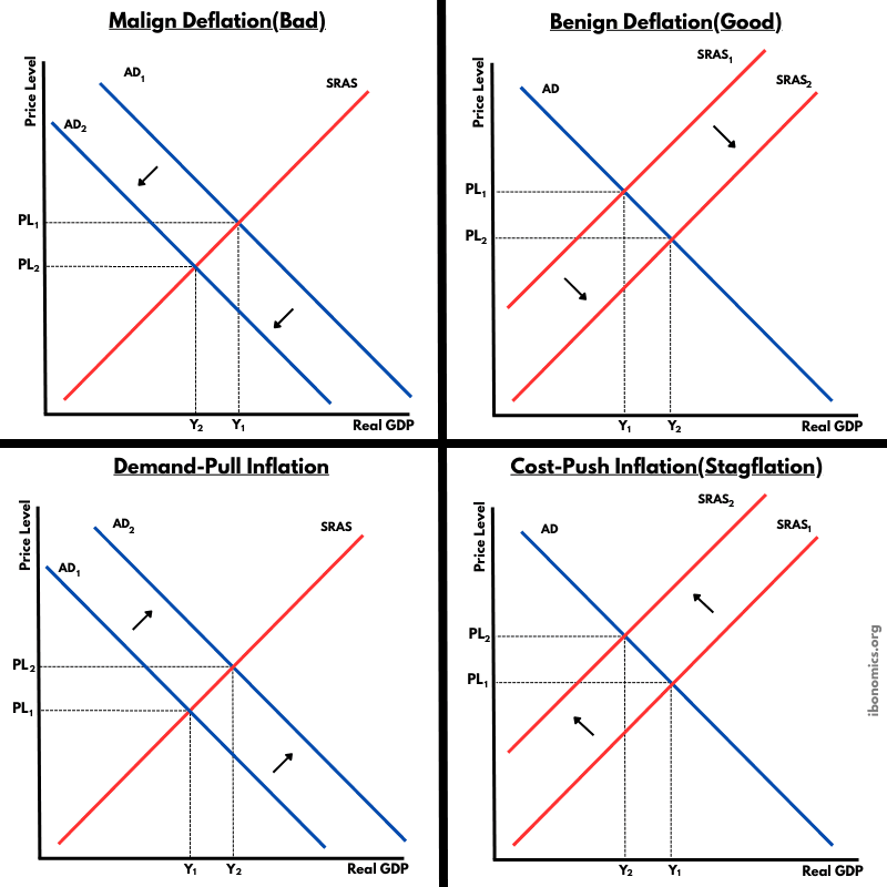
    Types of Inflation and Deflation – Demand Pull, Cost Push, Benign, and Malign diagram

    Curves and elements

    aggregate demand
    AD: Aggregate demand shows total spending on domestic output at different price levels. Shifts right increase the price level and real GDP. Shifts left reduce the price level and real GDP.
    short run aggregate supply
    SRAS: Short-run aggregate supply shows real output produced at different price levels. Shifts right lower the price level and raise real GDP. Shifts left raise the price level and reduce real GDP.

    Key explanations

    1. 1

      Demand-pull inflation happens when aggregate demand increases from AD1 to AD2, causing the price level to rise and real GDP to increase. Potential cause: increased consumer spending due to lower interest rates.

    2. 2

      Cost-push inflation happens when short-run aggregate supply decreases from SRAS1 to SRAS2, causing the price level to rise while real GDP falls. Potential cause: a rise in oil or energy prices that increases production costs.

    3. 3

      Benign deflation happens when short-run aggregate supply increases from SRAS1 to SRAS2, causing the price level to fall while real GDP rises. Potential cause: productivity growth from improved technology.

    4. 4

      Malign deflation happens when aggregate demand decreases from AD1 to AD2, causing the price level to fall while real GDP falls. Potential cause: a fall in consumer confidence leading to lower consumption and investment.

    Example exam question

    Using the diagrams, explain why cost-push inflation and malign deflation are likely to reduce real output.

    Show example answer

    Cost-push inflation reduces real output because SRAS shifts left due to higher production costs, raising the price level while lowering real GDP. Malign deflation reduces real output because AD shifts left due to weaker spending in the economy, lowering both the price level and real GDP. In both cases, output falls because the economy experiences either reduced supply capacity in the short run or reduced total demand.
    Try Our Interactive Quizzes

    At Ibonomics we believe in learning by doing. Test your understanding of economic diagrams with our interactive quizzes.

    More Macroeconomics Diagrams

    Explore other diagrams from the same unit to deepen your understanding

    macroeconomics
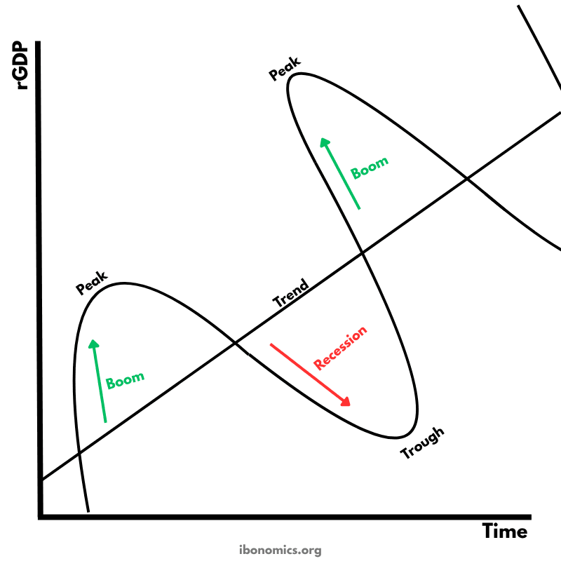
    Business Cycle – Real GDP Over Time
    Business Cycle – Real GDP Over Time

    A diagram illustrating the fluctuations in real GDP over time, including periods of boom, recession, peak, and trough, relative to the long-term trend of economic growth.

    6 curves/elements6 explanations
    macroeconomics
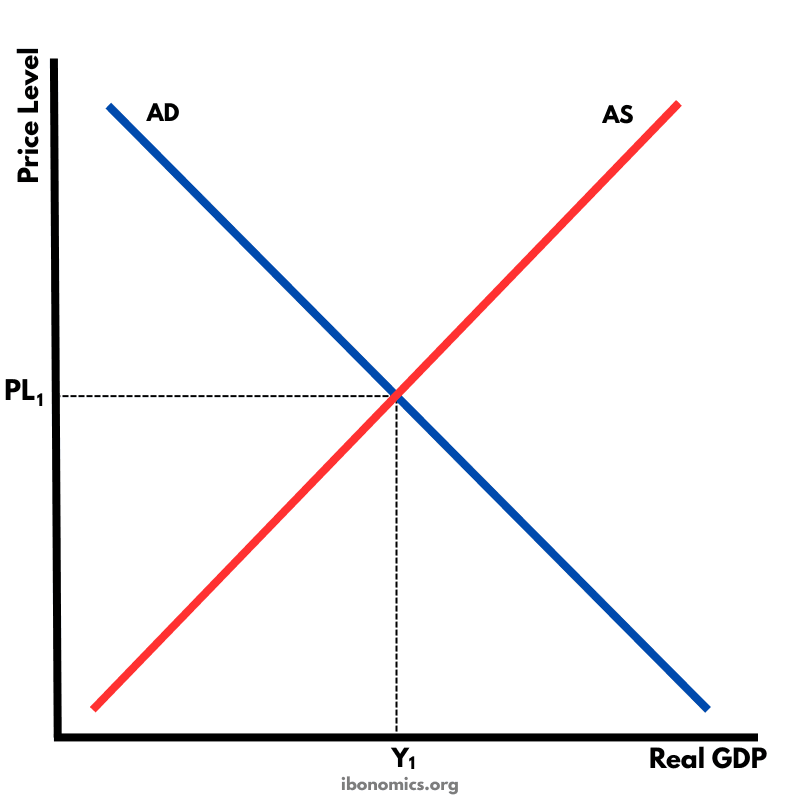
    AD–AS Diagram – Short-Run Macroeconomic Equilibrium
    AD–AS Diagram – Short-Run Macroeconomic Equilibrium

    This diagram shows the intersection of the aggregate demand (AD) and short-run aggregate supply (AS) curves to determine the equilibrium price level and real GDP.

    4 curves/elements5 explanations
    macroeconomics
    Classical AD–SRAS–LRAS Diagram – Long-Run Equilibrium
    Classical AD–SRAS–LRAS Diagram – Long-Run Equilibrium

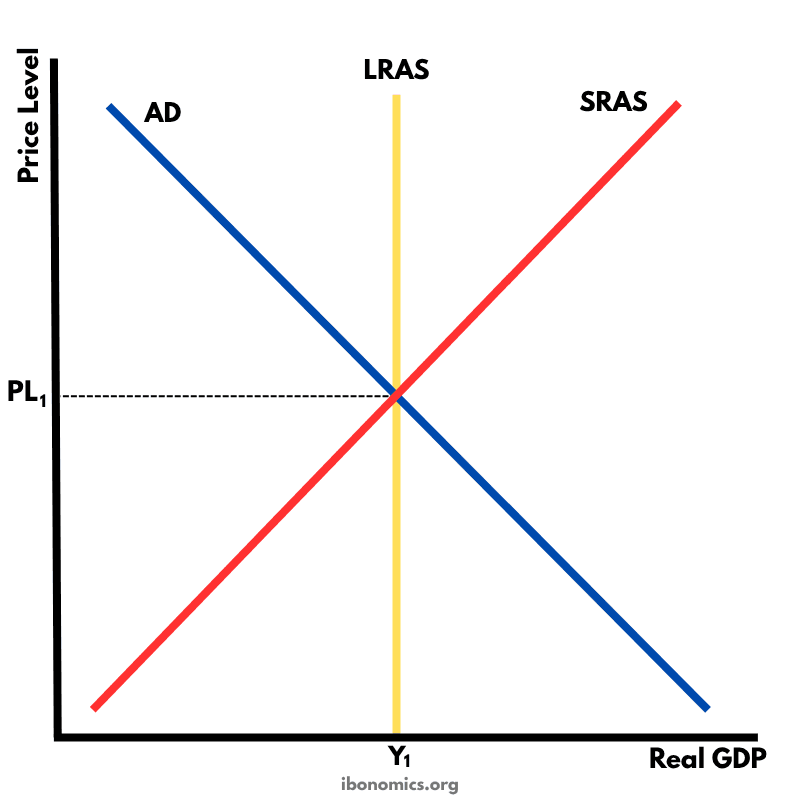
    A diagram showing the Classical model of aggregate demand (AD), short-run aggregate supply (SRAS), and long-run aggregate supply (LRAS), used to explain long-run macroeconomic equilibrium.

    5 curves/elements5 explanations
    macroeconomics
    Keynesian AD–LRAS Diagram – Demand Management and Full Employment
    Keynesian AD–LRAS Diagram – Demand Management and Full Employment

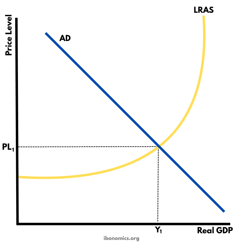
    A Keynesian aggregate demand and long-run aggregate supply (AD–LRAS) diagram showing how real GDP and the price level interact across different phases of the economy, including spare capacity and full employment.

    4 curves/elements5 explanations
    macroeconomics
    Output/Deflationary Gap – Below Full Employment Equilibrium
    Output/Deflationary Gap – Below Full Employment Equilibrium

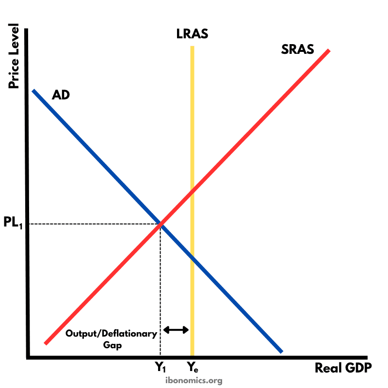
    A diagram showing an output (deflationary) gap, where the economy is producing below its full employment level of output (Ye).

    7 curves/elements5 explanations
    macroeconomicsHL
    Keynesian Multiplier Effect – Shifts in Aggregate Demand
    Keynesian Multiplier Effect – Shifts in Aggregate Demand

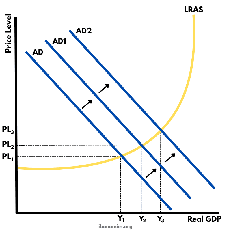
    This diagram shows how an initial increase in aggregate demand leads to a multiplied increase in national output (real GDP) and price level within the Keynesian framework.

    11 curves/elements5 explanations