How to Master IB Economics Diagrams
Learn how to draw, label and explain economics diagrams clearly for both your Internal Assessment and IB exams.
Choose the right model
Start with the diagram that best explains the economic scenario.
Label everything
Axes, curves, equilibria and movements should all be immediately clear.
Explain the economics
A diagram only earns value when you connect it to the analysis.
Internal Assessment
Getting full marks for Criterion A
Your IA diagrams need to be relevant, accurate, correctly labelled and fully explained.
IB requirement
“Relevant, accurate and correctly labelled diagrams are included, with a full explanation.”
Relevant
The diagram should directly connect to the economic concept and issue discussed in your article.
Accurate
Economic relationships, curves, movements and proportions should be shown correctly.
Correctly labelled
Axes, curves, points, equilibria and intersections should all be clearly identified.
Fully explained
Explain what changes in the diagram, why it changes and what the resulting economic effects are.
Example
Macroeconomic long-run equilibrium
This example shows the main features that make an economics diagram clear and useful.
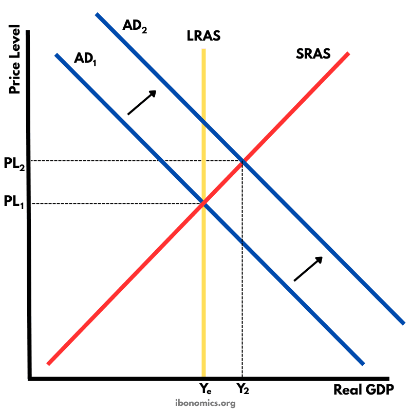
Macroeconomic long-run equilibrium showing the effects of expansionary fiscal policy
Essential elements
- Clear, descriptive title
- Fully labelled X and Y axes with appropriate units
- All curves labelled clearly, such as SRAS, LRAS, AD₁ and AD₂
- Price and output points marked clearly
Stronger presentation
- Equilibrium intersections easy to identify
- Arrows showing movements or curve shifts
- Sensible proportional scaling
- Clean and uncluttered presentation
Step by step
How to draw the diagram
Work through the diagram in a consistent order so that nothing important is forgotten.
IA diagrams are worth marks and are completed outside exam conditions, so take the time to make them accurate and clear.
Planning
- Choose the most relevant diagram for the article.
- Identify the economic concept being illustrated.
- Decide the layout and size before beginning.
Drawing
- Draw the axes first, then add curves and lines.
- Use a ruler for straight lines.
- Keep curves smooth and sensibly proportioned.
- Mark equilibrium intersections clearly.
Labelling
- Add a clear diagram title.
- Label both axes with the correct variables.
- Label every curve and important line.
- Show shifts and movements with arrows where useful.
Explanation
Walk through the economics in the same order that the reader sees it on the diagram.
“The economy initially starts in long-run equilibrium where AD₁ intersects both SRAS and LRAS at point E₁, with price level P₁ and real GDP at Y₁. The government then implements expansionary fiscal policy...”
- Explain the initial equilibrium.
- Describe what causes the change.
- Analyse the movement and new equilibrium.
- Explain the economic implications.
Exam technique
Drawing diagrams under exam conditions
In an exam, the goal is accuracy and clarity without spending unnecessary time perfecting the artwork.
Essential elements
- Clear title
- Labelled axes
- Labelled curves
- Key points marked
- Brief explanation
Time-saving habits
- Practise common diagrams until the process becomes automatic.
- Use standard abbreviations such as MC, MR and AR where appropriate.
- Prioritise accuracy over visual perfection.
- Aim for roughly 5–7 minutes per diagram when appropriate.
- Keep explanations concise but complete.
IB diagram guidance for exams
“Represent by means of a labelled, accurate diagram or graph, using a pencil. A ruler (straight edge) should be used for straight lines. Diagrams should be drawn to scale. Graphs should have points correctly plotted and joined in a straight line or smooth curve.”
Before the exam
Three habits that make diagrams easier
Practise regularly
Redraw common diagrams until the sequence of axes, curves and labels becomes automatic.
Check your work
Confirm that the diagram actually matches the economic scenario described in the question or article.
Understand the model
Memorising a shape is not enough. Know what every line and movement represents.
Continue practising
Build your diagram skills
Use the rest of IBonomics to practise diagrams and strengthen the theory behind them.