IBonomics Logo

IBonomics

Comprehensive study materials and practice quizzes for IB Economics students aiming for 6–7 scores. Created by tutors, for students.

Contact Us

Follow IBonomics

All social links

Quick Links

  • Search
  • Exam Overview
  • Practice Quizzes
  • Unit-Based Quizzes
  • Sign Up
  • Become a Tutor
  • Contact
  • Announcements

Study Resources

  • Microeconomics
  • Macroeconomics
  • Real-World Examples
  • International Economics
  • IA Guide
  • Mock Exams
  • Flashcards
  • Economics Briefs
  • Find a Tutor

Legal & Policies

  • Privacy Policy
  • Cookie Policy
  • Disclaimer
Official Resources
IB Organization

© 2026 IBonomics. All rights reserved.

Created by tutors for students. Not affiliated with the International Baccalaureate Organization.

    Positive Externality of ProductionSL

    Microeconomics

    A diagram illustrating a positive externality of production, where the marginal social cost (MSC) is lower than the marginal private cost (MPC), leading to underproduction and welfare loss.
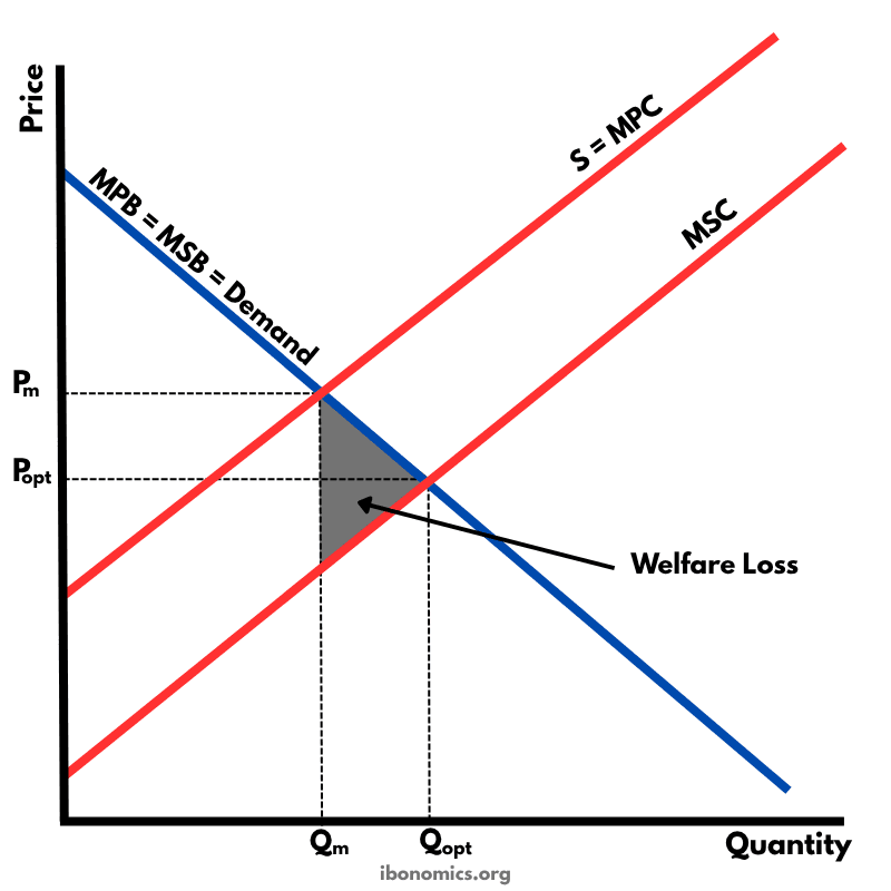
    Positive Externality of Production diagram

    Curves and elements

    demand
    Demand Curve (MPB = MSB): Represents marginal private and social benefit, assuming no externalities in consumption.
    mpc
    MPC (S): Marginal private cost — the cost borne by producers.
    msc
    MSC: Marginal social cost — the lower true cost to society, including external benefits.
    price effect
    Price Effect: The socially optimal price (Popt) is lower than the market price (Pm).
    quantity effect
    Quantity Effect: The free market underproduces (Qm) compared to the socially optimal quantity (Qopt).
    welfare loss
    Welfare Loss: The triangle representing the deadweight loss due to underproduction caused by unaccounted external benefits.

    Key explanations

    1. 1

      Positive externalities of production occur when a firm's output generates external benefits to third parties that are not reflected in market prices.

    2. 2

      In the free market equilibrium, firms produce at Qm where marginal private cost (MPC) equals marginal private benefit (MPB), resulting in price Pm.

    3. 3

      However, the socially optimal output is Qopt, where marginal social cost (MSC) equals marginal social benefit (MSB).

    4. 4

      Because MSC < MPC, the market underproduces (Qm < Qopt), and too few resources are allocated to the good.

    5. 5

      The shaded triangle represents welfare loss — the benefit to society that is lost due to the lower level of production.

    Example exam question

    Using a diagram, explain how a positive externality of production can lead to market failure. Suggest a policy a government could use to correct the underproduction.

    Show example answer

    In the diagram, the market equilibrium is at Qm and Pm, where firms only consider private costs (MPC). However, production also creates external benefits (e.g. research spillovers or job training), which means the true cost to society is lower (MSC). The optimal level of output is Qopt at price Popt, where MSC = MSB. Underproduction causes welfare loss, as shown by the shaded triangle. The government could encourage increased output through subsidies, tax breaks, or direct provision, moving the market closer to the socially optimal level.

    Real-world examples that use this diagram

    Case studies you can cite alongside this diagram in Paper 1.

    Wind turbines and solar panels receiving financial support for renewable energy investment

    EU Renewable Energy Support Schemes

    Subsidy Policy2024 onwards

    Articles that explain this diagram

    Written explanations of the theory behind this diagram.

    How to Draw Externality Diagrams Without Memorising

    How to Draw Externality Diagrams Without Memorising

    Externalities in IB Economics: Negative Externalities, Positive Externalities and Third-Party Effects

    Externalities in IB Economics: Negative Externalities, Positive Externalities and Third-Party Effects

    Try Our Interactive Quizzes

    At Ibonomics we believe in learning by doing. Test your understanding of economic diagrams with our interactive quizzes.

    More Microeconomics Diagrams

    Explore other diagrams from the same unit to deepen your understanding

    microeconomics
    Demand and Supply
    Demand and Supply

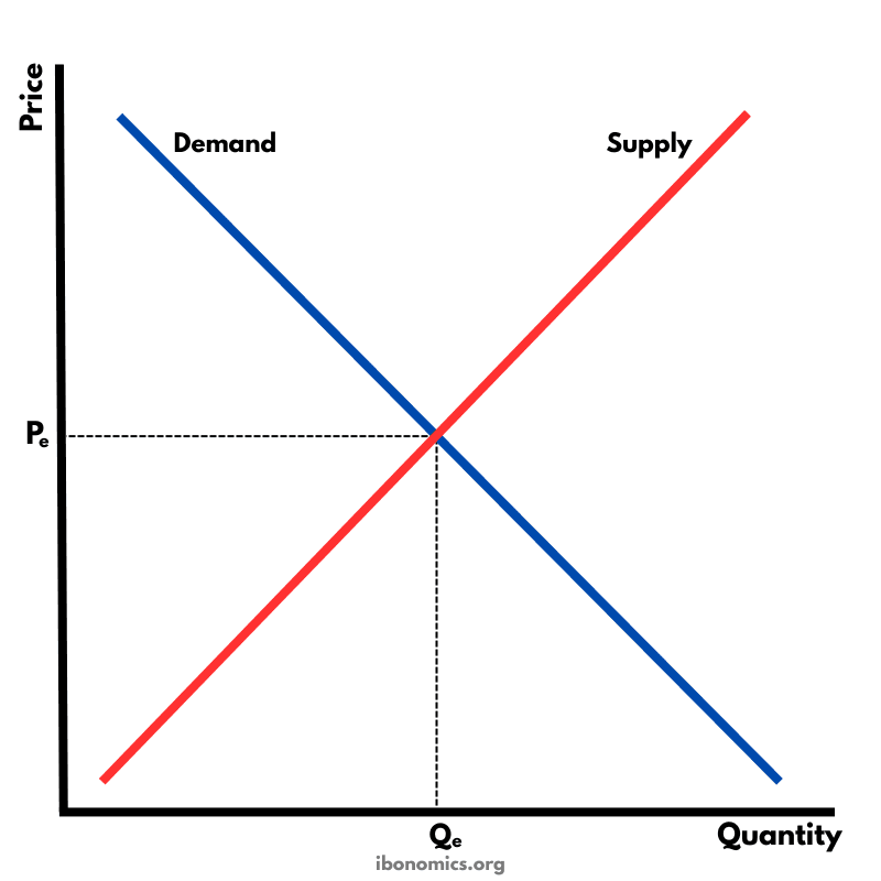
    The fundamental diagram showing the relationship between demand and supply in a competitive market, determining equilibrium price and quantity.

    3 curves/elements4 explanations
    microeconomics
    Demand Curve
    Demand Curve

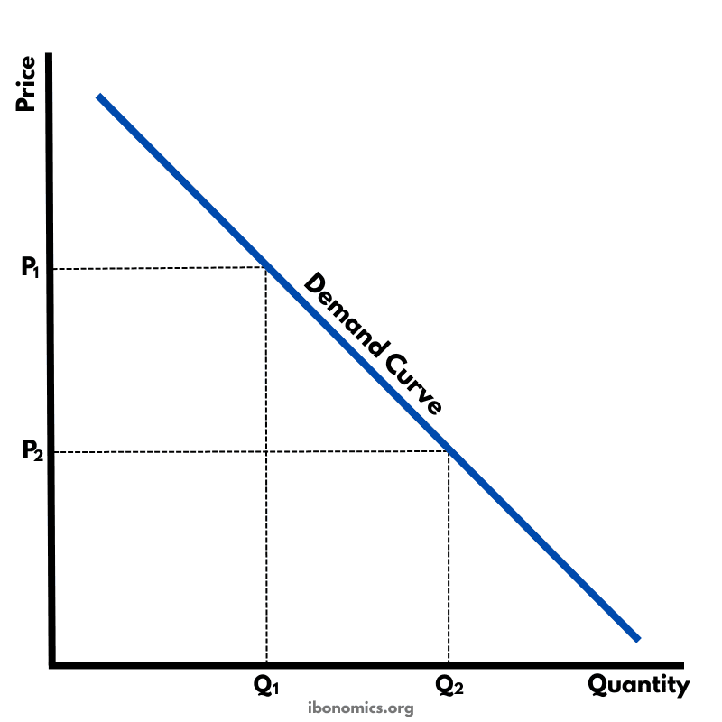
    A basic diagram showing the inverse relationship between price and quantity demanded, illustrating the law of demand.

    3 curves/elements4 explanations
    microeconomics
    Supply Curve
    Supply Curve

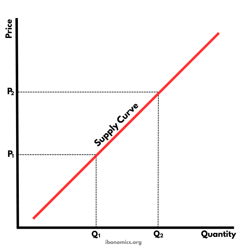
    A basic diagram showing the positive relationship between price and quantity supplied, illustrating the law of supply.

    3 curves/elements4 explanations
    microeconomics
    Forms of Government Intervention
    Forms of Government Intervention

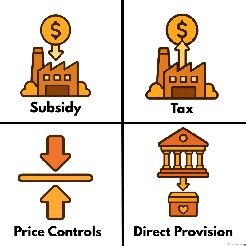
    A simple diagram showing four common forms of government intervention in markets: subsidies, taxes, price controls, and direct provision.

    4 curves/elements4 explanations
    microeconomics
    Elasticity Along a Demand Curve
    Elasticity Along a Demand Curve

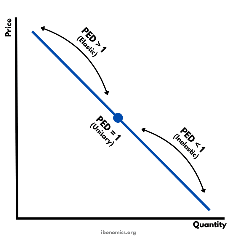
    A diagram showing how price elasticity of demand changes along a straight-line demand curve, from elastic to unitary elastic to inelastic.

    4 curves/elements4 explanations
    microeconomics
    Price Elasticity of Demand and Total Revenue
    Price Elasticity of Demand and Total Revenue

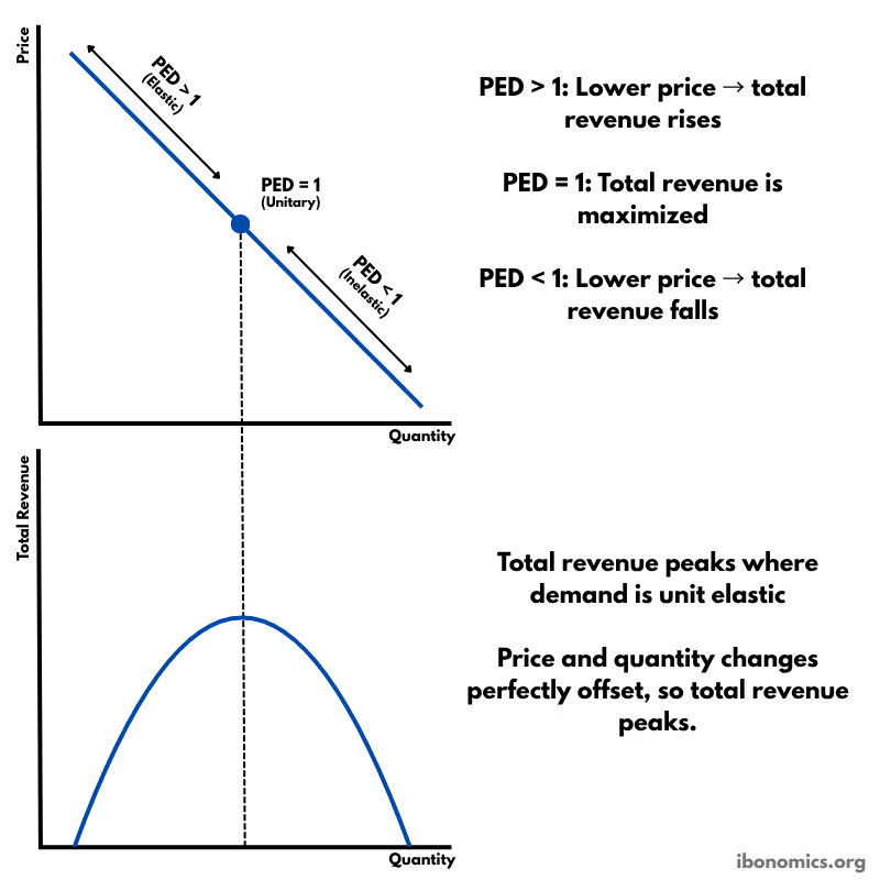
    A diagram showing how price elasticity of demand affects total revenue, with total revenue maximized where demand is unitary elastic.

    5 curves/elements4 explanations