Pigouvian Tax to Correct a Negative Externality of ProductionSL
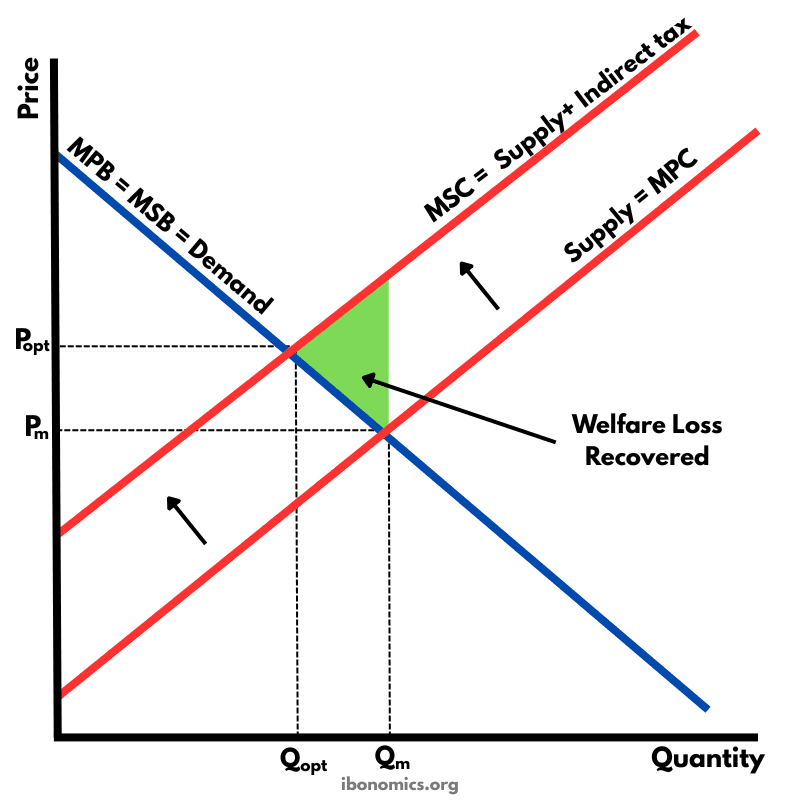
MicroeconomicsA diagram illustrating how a Pigouvian tax corrects a negative externality of production by internalising external costs, shifting supply from MPC to MSC and reducing overproduction.
Curves and elements
- demand
- Demand Curve (MPB = MSB): Represents marginal private and social benefit, assuming no externalities in consumption.
- mpc
- MPC (Supply): Marginal private cost before the tax, reflecting only producers’ private costs.
- msc
- MSC (Supply + tax): Marginal social cost after the Pigouvian tax, including external costs.
- price effect
- Price Effect: The price rises from Pm to Popt after the tax is imposed.
- quantity effect
- Quantity Effect: Output falls from Qm to Qopt, reducing overproduction.
- welfare loss
- Welfare Loss Recovered: The shaded area shows the reduction in deadweight loss as the tax leads to allocative efficiency.
Key explanations
- 1
A negative externality of production occurs when firms impose external costs on third parties, such as pollution, which are not included in market prices.
- 2
In the free market, output is produced at Qm where marginal private cost (MPC) equals marginal private benefit (MPB), leading to overproduction.
- 3
The Pigouvian tax increases firms’ costs by the size of the external cost, shifting the supply curve upward from MPC to MSC (MPC + tax).
- 4
After the tax, the market output falls from Qm to the socially optimal level Qopt, where MSC equals MSB.
- 5
The green shaded area shows welfare loss recovered, as the tax corrects the market failure and leads to a more efficient allocation of resources.
Example exam question
Using a diagram, explain how a Pigouvian tax can correct a negative externality of production.
Show example answer
In the diagram, the free market produces at Qm where MPC = MPB, ignoring external costs such as pollution. A Pigouvian tax equal to the external cost shifts the supply curve from MPC to MSC. This raises the price faced by consumers and reduces output to the socially optimal level Qopt, where MSC = MSB. As a result, overproduction is reduced and welfare loss is eliminated, correcting the market failure.