IBonomics Logo

IBonomics

Comprehensive study materials and practice quizzes for IB Economics students aiming for 6–7 scores. Created by tutors, for students.

Contact Us

Follow IBonomics

All social links

Quick Links

  • Search
  • Exam Overview
  • Practice Quizzes
  • Unit-Based Quizzes
  • Sign Up
  • Become a Tutor
  • Contact
  • Announcements

Study Resources

  • Microeconomics
  • Macroeconomics
  • Real-World Examples
  • International Economics
  • IA Guide
  • Mock Exams
  • Flashcards
  • Economics Briefs
  • Find a Tutor

Legal & Policies

  • Privacy Policy
  • Cookie Policy
  • Disclaimer
Official Resources
IB Organization

© 2026 IBonomics. All rights reserved.

Created by tutors for students. Not affiliated with the International Baccalaureate Organization.

    Economic Growth vs Economic Development – PPC Shift and ReallocationSL

    Global Economics

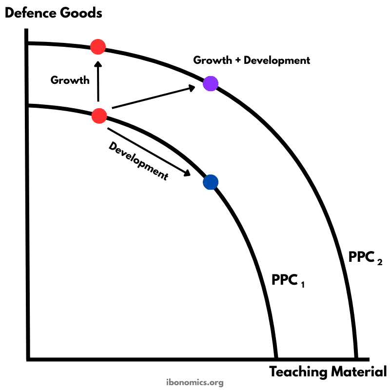
    This diagram illustrates the difference between economic growth and economic development using production possibility curves (PPCs). Economic development can occur through a reallocation of resources along an existing PPC, while economic growth is represented by an outward shift of the PPC due to increased productive capacity.
    Economic Growth vs Economic Development – PPC Shift and Reallocation diagram

    Curves and elements

    ppc1
    PPC₁: The initial production possibility curve showing maximum output combinations with existing resources and technology.
    ppc2
    PPC₂: The outward-shifted production possibility curve showing increased productive capacity due to economic growth.
    development point
    Point on PPC₁ with more teaching material and fewer defence goods: Represents economic development without growth.
    growth point
    Point on PPC₁ with more defence goods: Represents growth in output composition without development benefits.
    growth development point
    Point on PPC₂ with more of both goods: Represents both economic growth and economic development.

    Key explanations

    1. 1

      The initial production possibility curve (PPC₁) shows the maximum combination of defence goods and teaching material that the economy can produce with existing resources and technology.

    2. 2

      A movement along PPC₁ from the initial point toward more teaching material (blue point) represents economic development without growth, as resources are reallocated toward goods that may improve welfare without increasing total capacity.

    3. 3

      A movement along PPC₁ toward more defence goods (upper red point) represents economic growth in output composition without development, since production shifts toward goods that may not improve general living standards.

    4. 4

      The outward shift from PPC₁ to PPC₂ represents economic growth, caused by factors such as technological progress, increased resources, improved human capital, or productivity gains.

    5. 5

      The movement to the point on PPC₂ (purple point) shows both economic growth and development, since the economy can now produce more of both goods compared to the initial situation.

    6. 6

      The diagram highlights that growth and development are related but distinct concepts: growth increases productive capacity, while development focuses on improving welfare and living standards.

    Example exam question

    Using a PPC diagram, explain how economic growth differs from economic development.

    Show example answer

    Economic growth refers to an increase in an economy’s productive capacity, shown by an outward shift of the PPC. Economic development refers to improvements in welfare and living standards, which can occur either through growth or through reallocating resources toward goods that benefit society more. In the diagram, movement along PPC₁ represents development without growth, while the shift to PPC₂ represents growth.
    Real-world examples that use this diagram

    Case studies you can cite alongside this diagram in Paper 1.

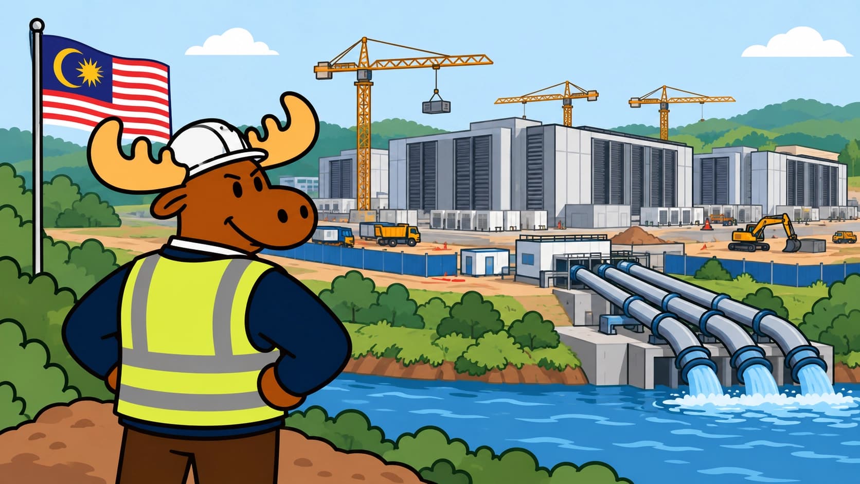
    Illustration representing global economics and cross-border investment.

    Johor's AI Data Centre Boom: FDI, Supply-Side Growth and Sustainability

    Development Strategy2022–present

    Try Our Interactive Quizzes

    At Ibonomics we believe in learning by doing. Test your understanding of economic diagrams with our interactive quizzes.

    More Global Economics Diagrams

    Explore other diagrams from the same unit to deepen your understanding

    global-economics
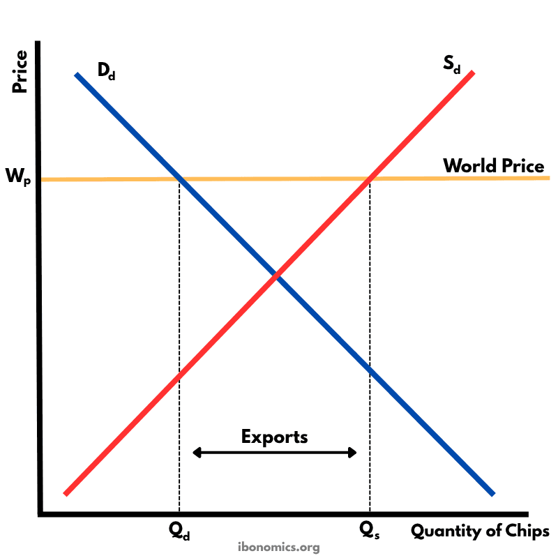
    Free Trade – Exporting Country
    Free Trade – Exporting Country

    This diagram shows how a country exports goods under free trade when the world price is higher than the domestic equilibrium price.

    6 curves/elements5 explanations
    global-economics
    Free Trade – Importing Country
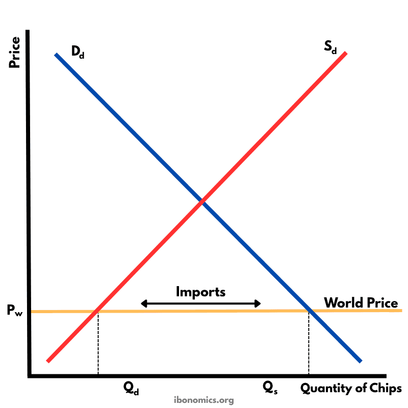
    Free Trade – Importing Country

    This diagram illustrates how a country imports goods under free trade when the world price is lower than the domestic equilibrium price.

    6 curves/elements5 explanations
    global-economics
    Tariff Diagram – Protectionism
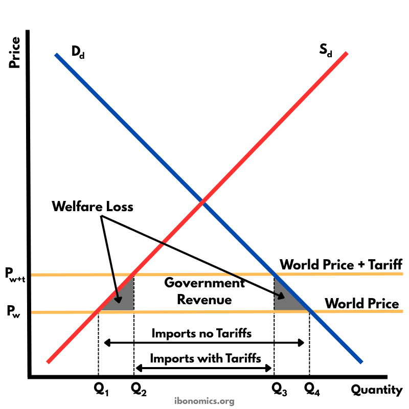
    Tariff Diagram – Protectionism

    This diagram shows the effects of a tariff imposed on imported goods. A tariff raises the price of imports, protecting domestic producers but creating welfare losses.

    12 curves/elements5 explanations
    global-economics
    Quota Diagram – Protectionism
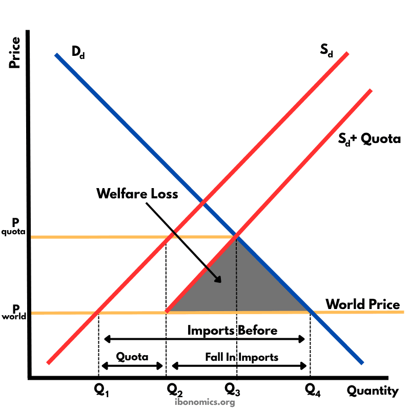
    Quota Diagram – Protectionism

    This diagram shows the impact of an import quota that limits how many units of a good can be imported. By restricting imports, the domestic price rises above the world price, domestic producers expand output, consumers buy less, and there is a net welfare loss.

    12 curves/elements7 explanations
    global-economics
    Production Subsidy Diagram – Protectionism
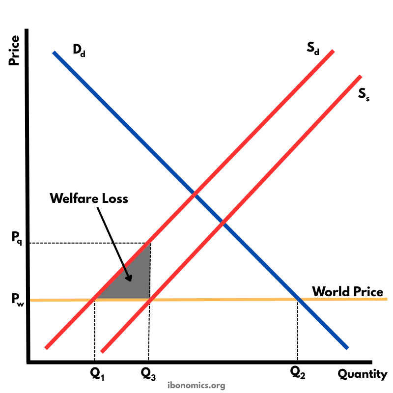
    Production Subsidy Diagram – Protectionism

    This diagram illustrates the effects of a production subsidy, where the government supports domestic producers to lower their costs and increase output. It is a form of protectionism without raising consumer prices directly.

    9 curves/elements5 explanations
    global-economics
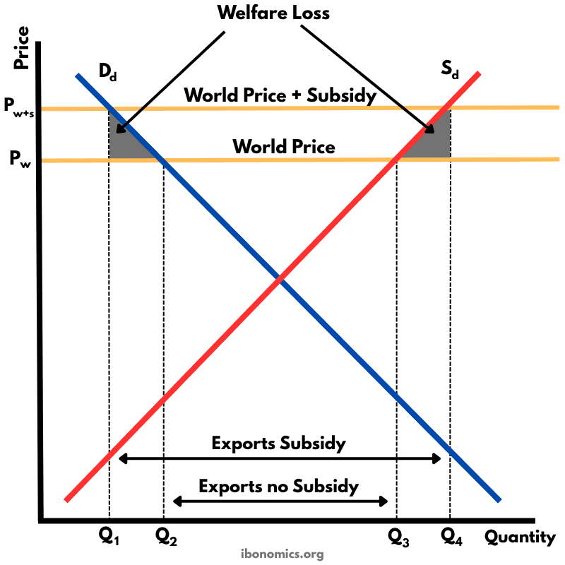
    Export Subsidy – Price Effects and Welfare Loss
    Export Subsidy – Price Effects and Welfare Loss

    This diagram shows how an export subsidy raises the domestic price above the world price, encouraging producers to export more while reducing consumer welfare and creating deadweight losses.

    11 curves/elements5 explanations