Trade Diversion – Switching Import Sources After Joining a Trading BlocHL
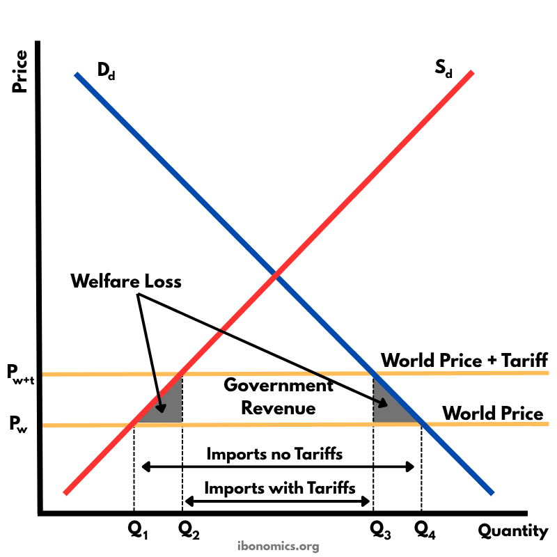
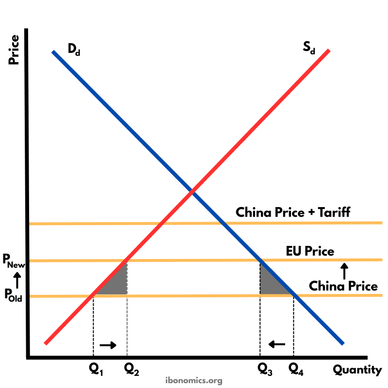
Global EconomicsThis diagram illustrates trade diversion: when a country (IBonomica) joins a trading bloc such as the EU and must impose a tariff on cheaper non-member imports (China). Because the EU now faces no tariff but China does, IBonomica switches its imports from the cheaper Chinese supplier to the more expensive EU supplier. Although imports increase from the EU, the overall price paid is higher than before, meaning global efficiency is reduced.
Curves and elements
- china price
- China Price: The lowest world price before tariffs, representing the most efficient supplier.
- china price tariff
- China Price + Tariff: Higher price after joining the EU, making Chinese goods less competitive.
- eu price
- EU Price: Higher than China’s original price but now cheaper relative to tariff-inflated Chinese imports.
- domestic supply
- Domestic Supply (Sd): Upward-sloping supply showing IBonomica's domestic producers.
- domestic demand
- Domestic Demand (Dd): Downward-sloping demand showing IBonomica's import needs.
Key explanations
- 1
IBonomica originally imports from China at the lowest world price, represented by the 'China Price' line.
- 2
After joining the EU trade bloc, IBonomica must impose a tariff on Chinese goods, raising their price to 'China Price + Tariff'.
- 3
EU goods now become relatively cheaper because they enter tariff-free, even though they are still more expensive than China’s original price.
- 4
IBonomica switches its imports from China to the EU, creating trade diversion: imports shift to a less efficient but tariff-favoured partner.
- 5
Consumers pay a higher price than before (EU price > original China price), causing a loss in global efficiency even though intra-bloc trade rises.
Example exam question
Using the trade diversion diagram, explain why joining a trading bloc can cause a country to import from a higher-cost producer and describe one disadvantage of this outcome.
Show example answer
Trade diversion occurs when a country joins a trading bloc and must place tariffs on cheaper non-member imports. In the diagram, IBonomica originally buys from China at the lowest world price, but after joining the EU it must impose a tariff on Chinese goods. This makes EU goods relatively cheaper, even though their base price is higher. IBonomica therefore switches imports from China to the EU, raising consumer prices and reducing global efficiency. The main disadvantage is that society pays more overall because production shifts from a lower-cost to a higher-cost supplier.